The Green Bus
Safer school transport, cleaner environment
The Green Bus provide safe and reliable transport to and from school, with no changes and no fuss. Powered by great customer service, their mission is to take unnecessary car journeys off the road, reducing school traffic and providing hire buses for school trips.
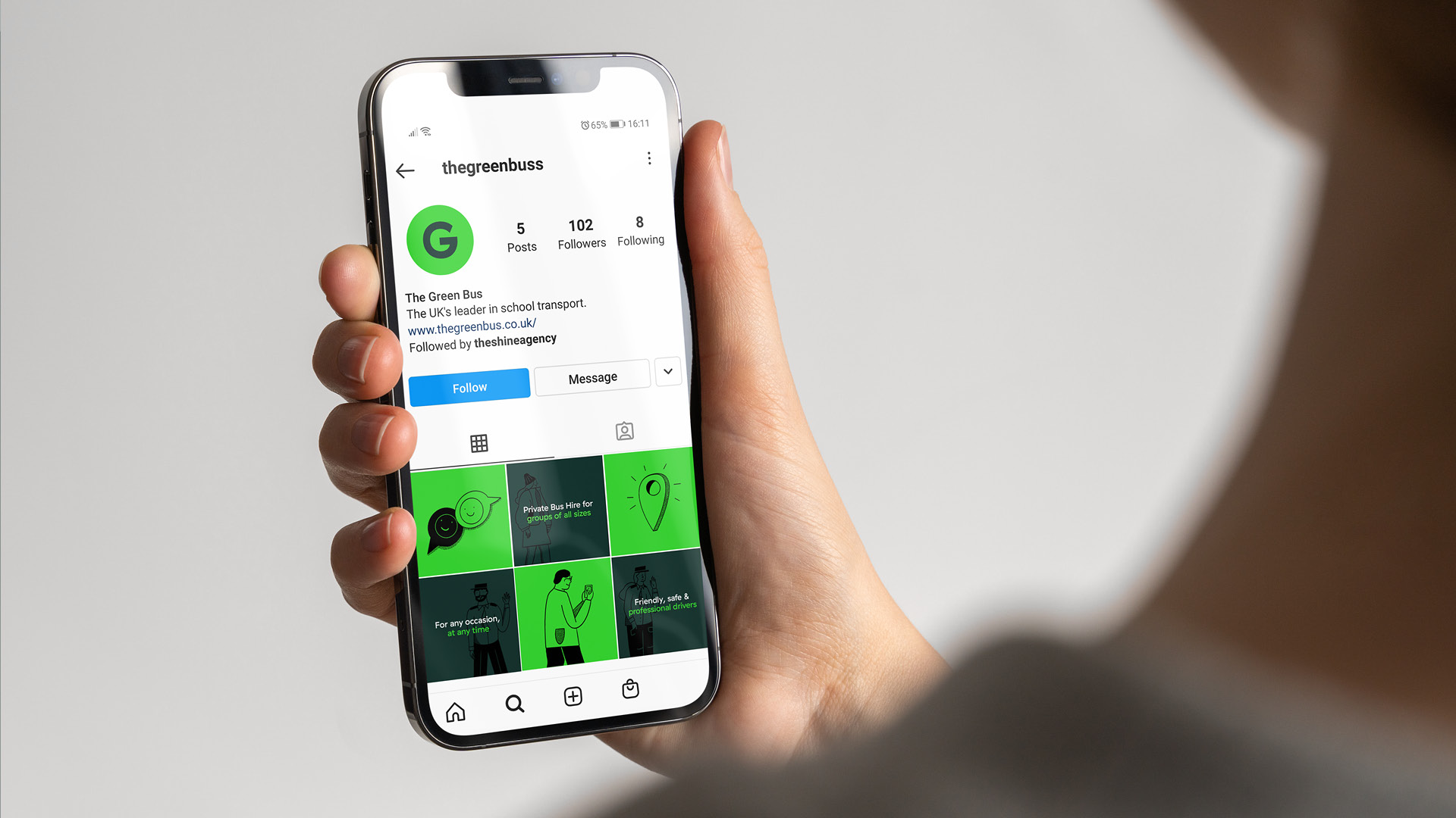
Having established themselves as the Midland’s leader in school transport for the last 15 years, the business began taking steps to expand their services and maximise their profitability. This is where our journey with The Green Bus began. Over the last year we have worked to develop their brand strategy, creative direction, tone of voice, website and social channels.
An honest approach
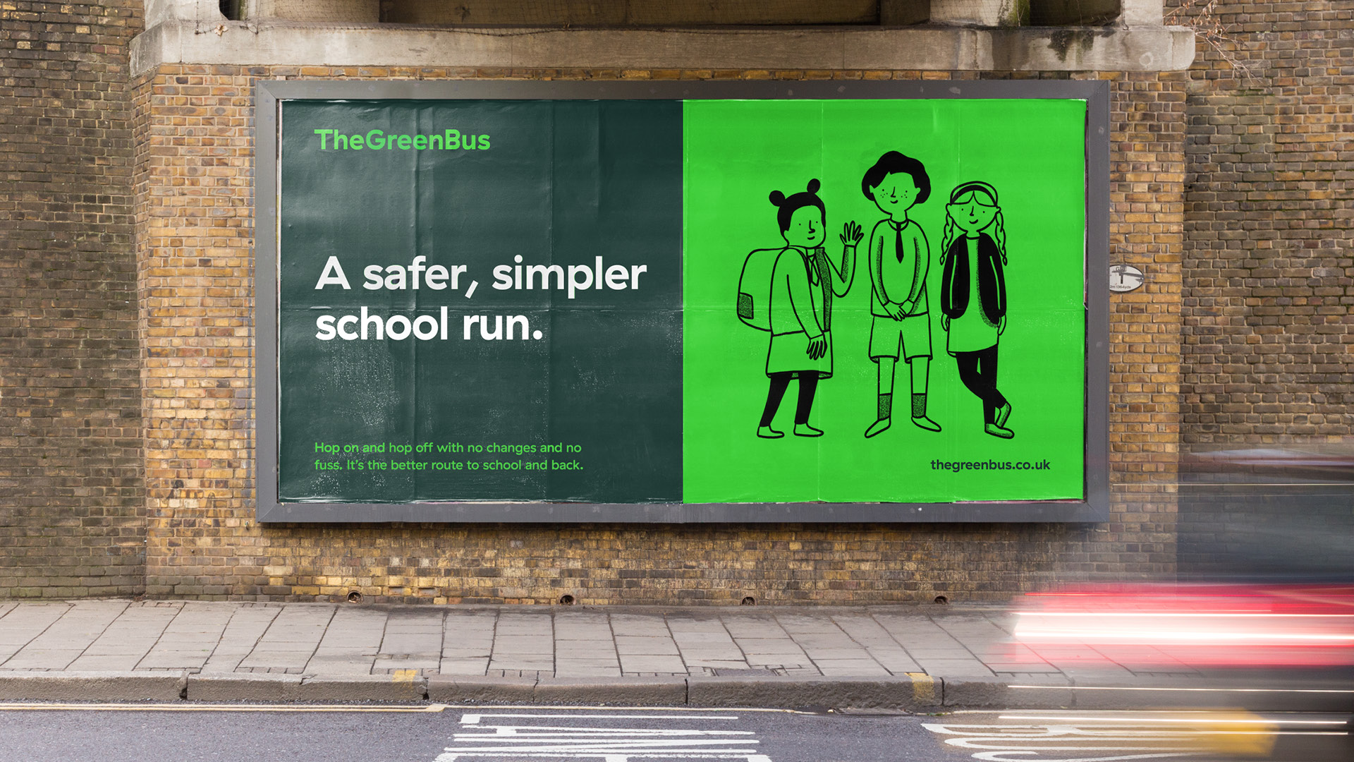
Our approach focused around their value proposition of ‘A safer, simpler school run’. We wanted to build a brand that clearly communicated their priorities of safety and reliability in an engaging way. With customer experience at the heart of everything they do, we created a flexible and scalable brand that aims to put customers minds at ease.
The human touch
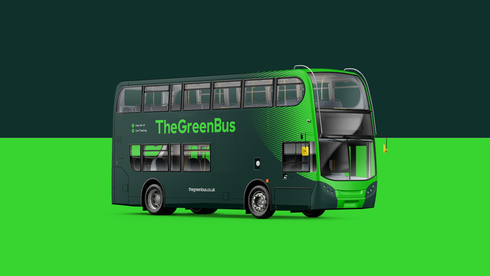
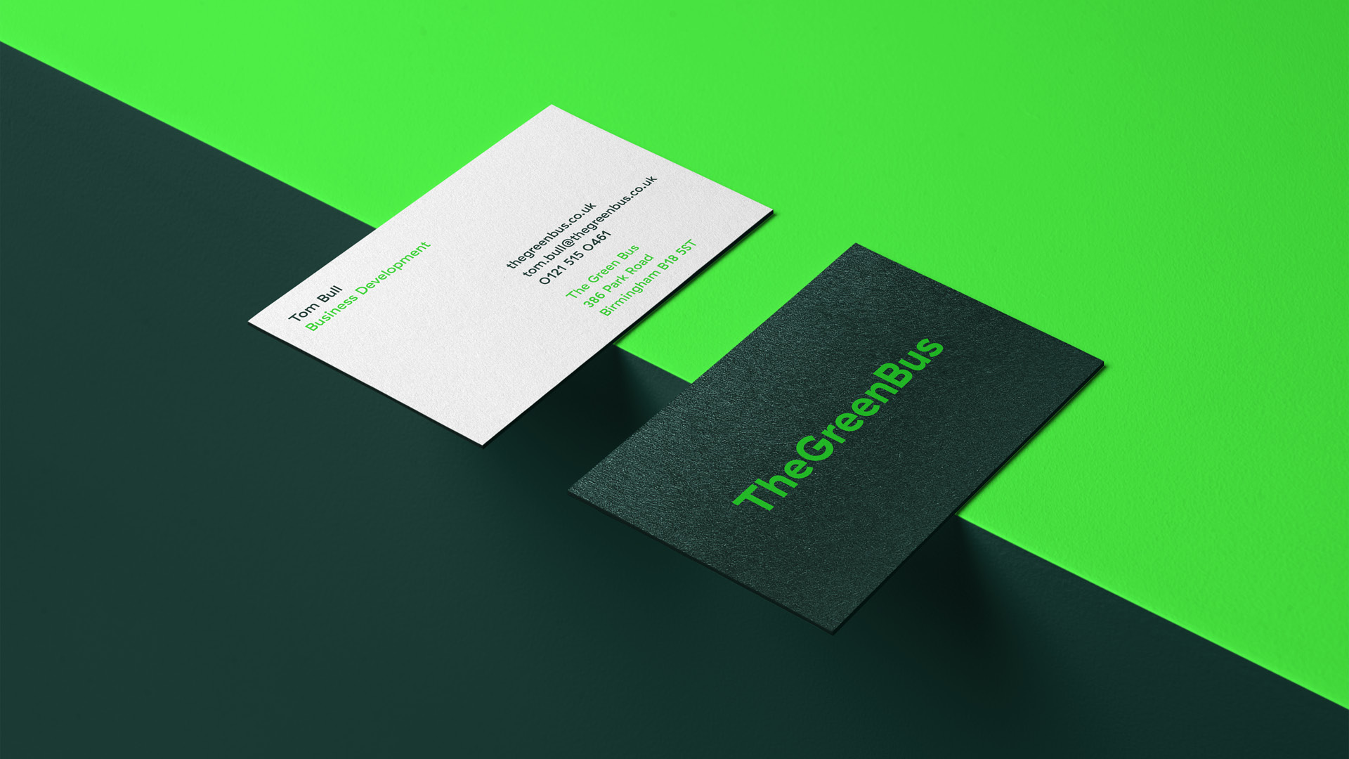
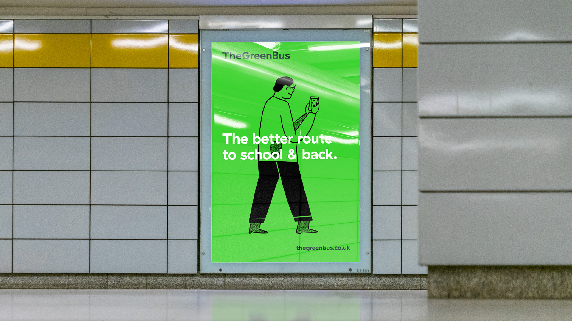
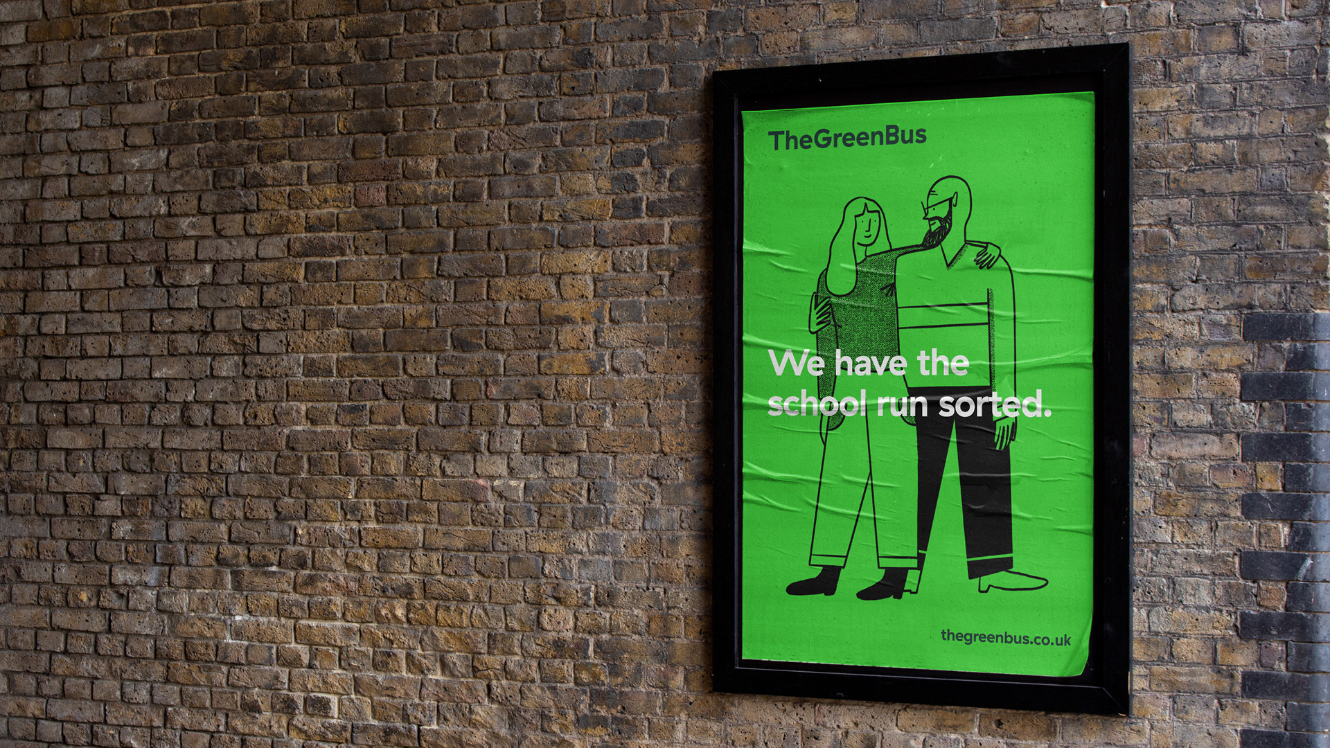
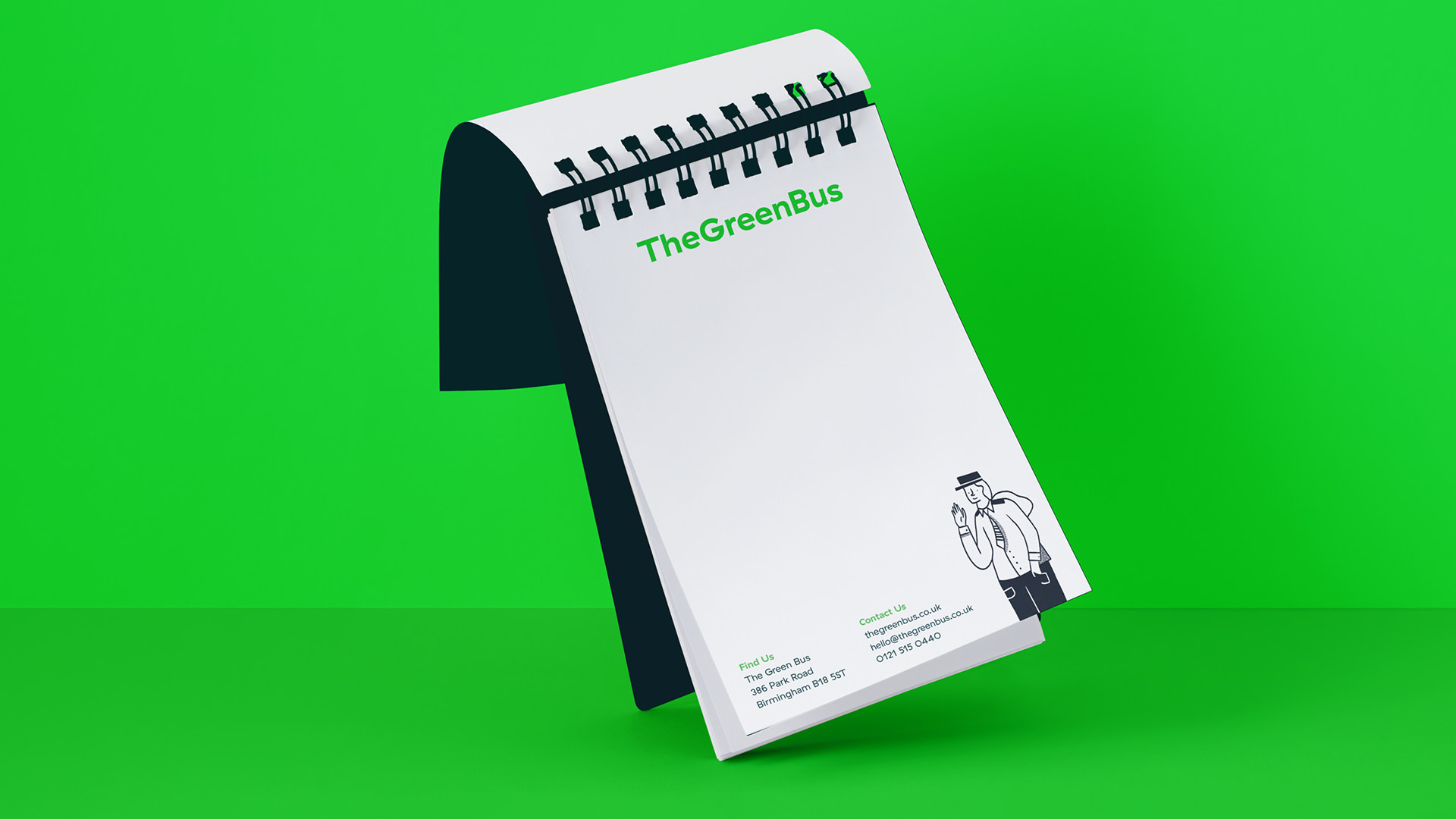
In a marketplace dominated with vehicle photography and staged lifestyle shots we wanted to build a brand that stood out from the crowd and did things a little differently. With the introduction of a refined but vibrant colour palette, giving the brand ownability, we were able to shift focus to the key brand messages. The confident but down to earth copy plays a key role in communicating The Green Bus’ commitment to its customers. This combined with Grilli Type’s GT Haptik brings bags of character and a human touch to the brand.

Relaxed direction
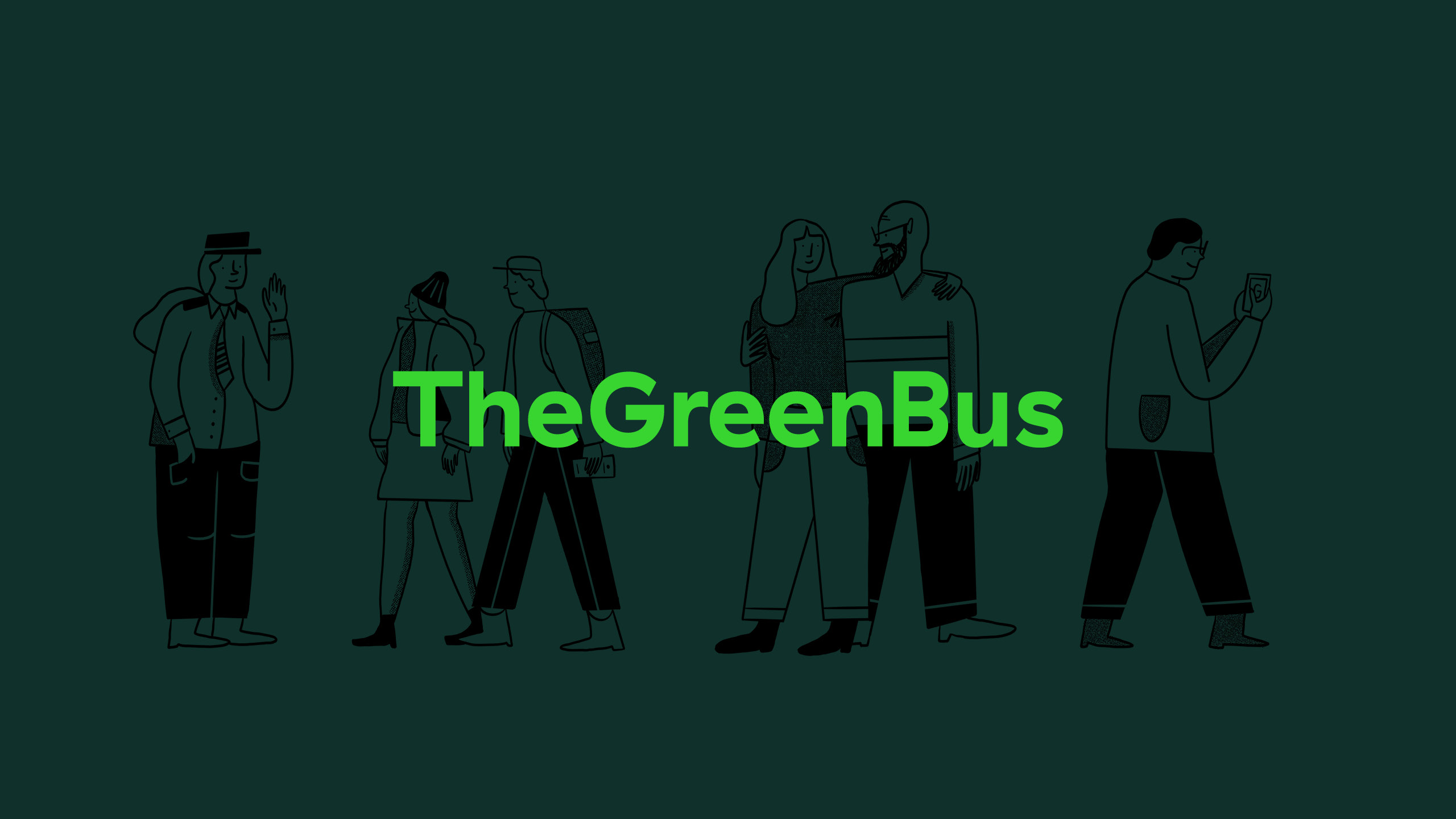
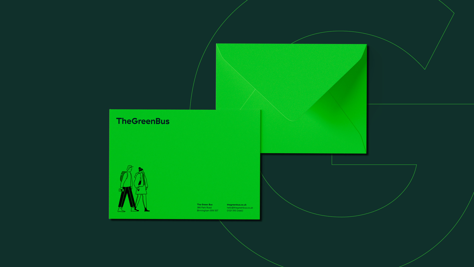
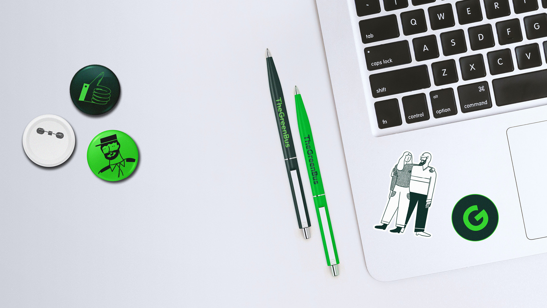
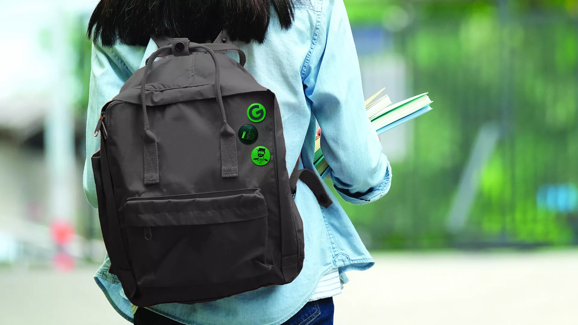
We worked with illustrator Isabella Bunnell to create a series of hand finished illustrations inspired by doodles found on children’s school books.
The playful illustrations added a warm and welcoming dimension to the brand direction, which help to connect with a wide demographic of customers in a fun and honest way.


Digital overhaul
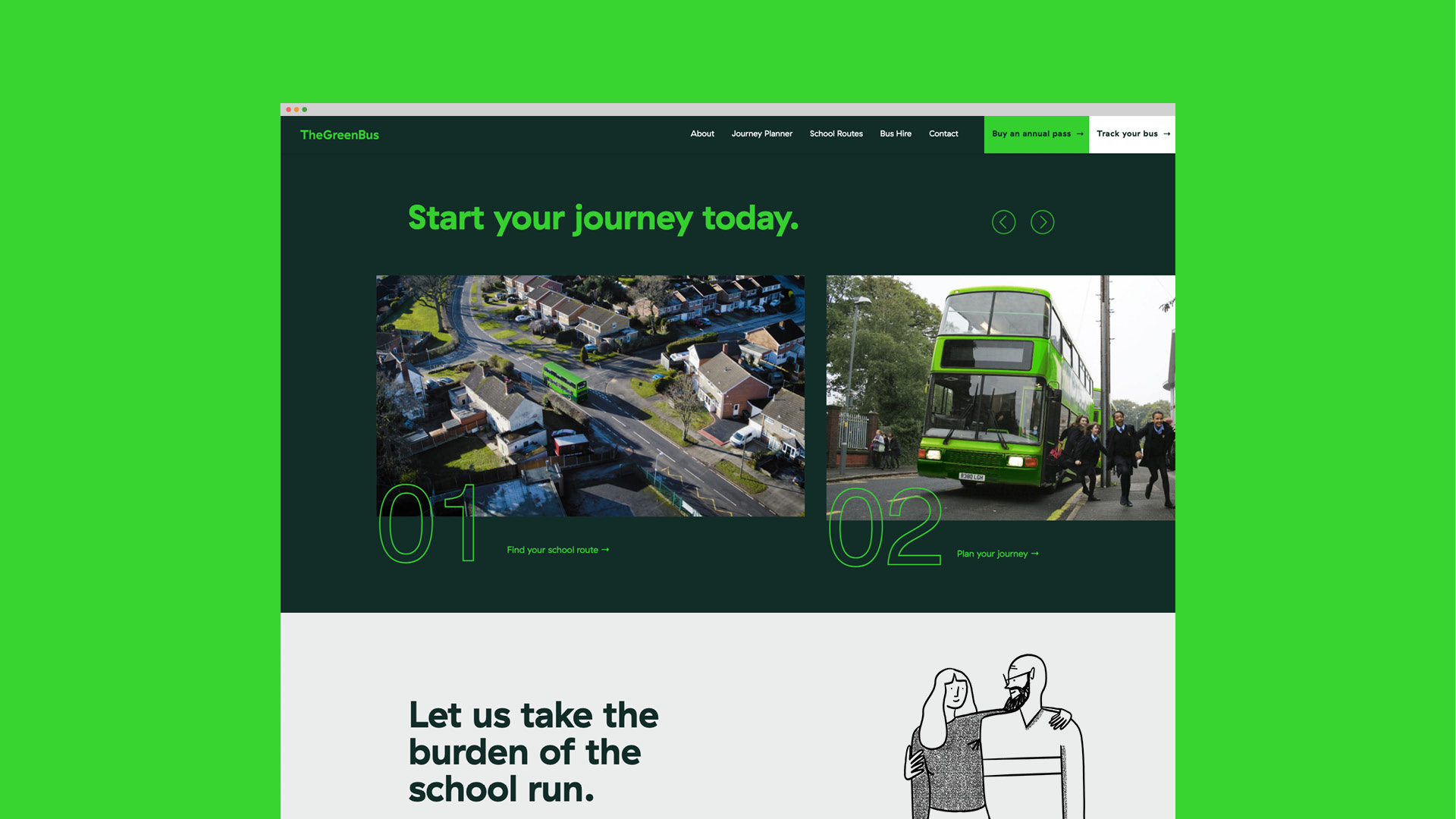
As their main driver of income, The Green Bus’ website is their most important asset. However after a few years of neglect the current site had become difficult to navigate and the customer journey was simply confusing.
Our main goal was to refine and implement a clear journey through the site for customers who wanted to book a bus pass. Our functional UI system allows the user to easily browse bus routes and timetables with clear calls to action throughout. We also incorporated a “Route Finder” system that allowed customers to find routes near to their home. Since its launch, the website has had its best return to date.


All illustrations by Isabella Bunnell
Animation by Andy Tomlinson
What We Do
We strip back the unnecessary and untangle the complex. Behind every creative project, there is a collaborative process and solid creative strategy built to deliver meaningful impact.
