A reflection of opulence and a time gone by.
One Hyndland Avenue
It’s not often that a new build opportunity arises in the heart of Glasgow’s West End. Westpoint Homes tasked us with creating a brochure that could take pride of place on their clients’ new coffee table.
With a nod to days gone by coupled with Westpoints unrelenting quest to produce desirable and coveted luxury apartments – One Hyndland Avenue was conceived.
The brand
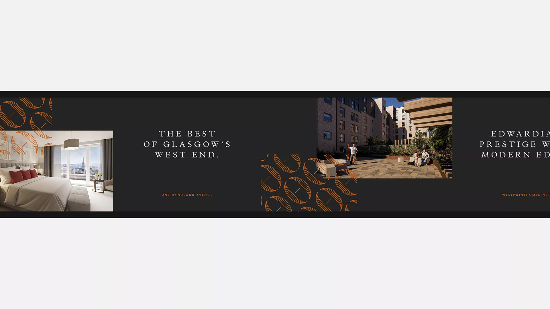
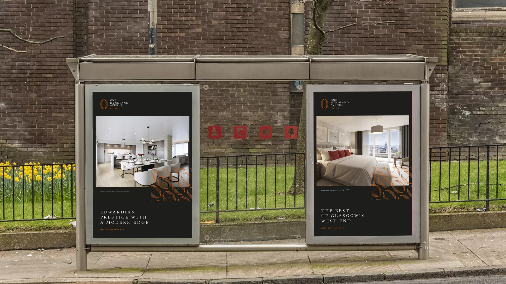
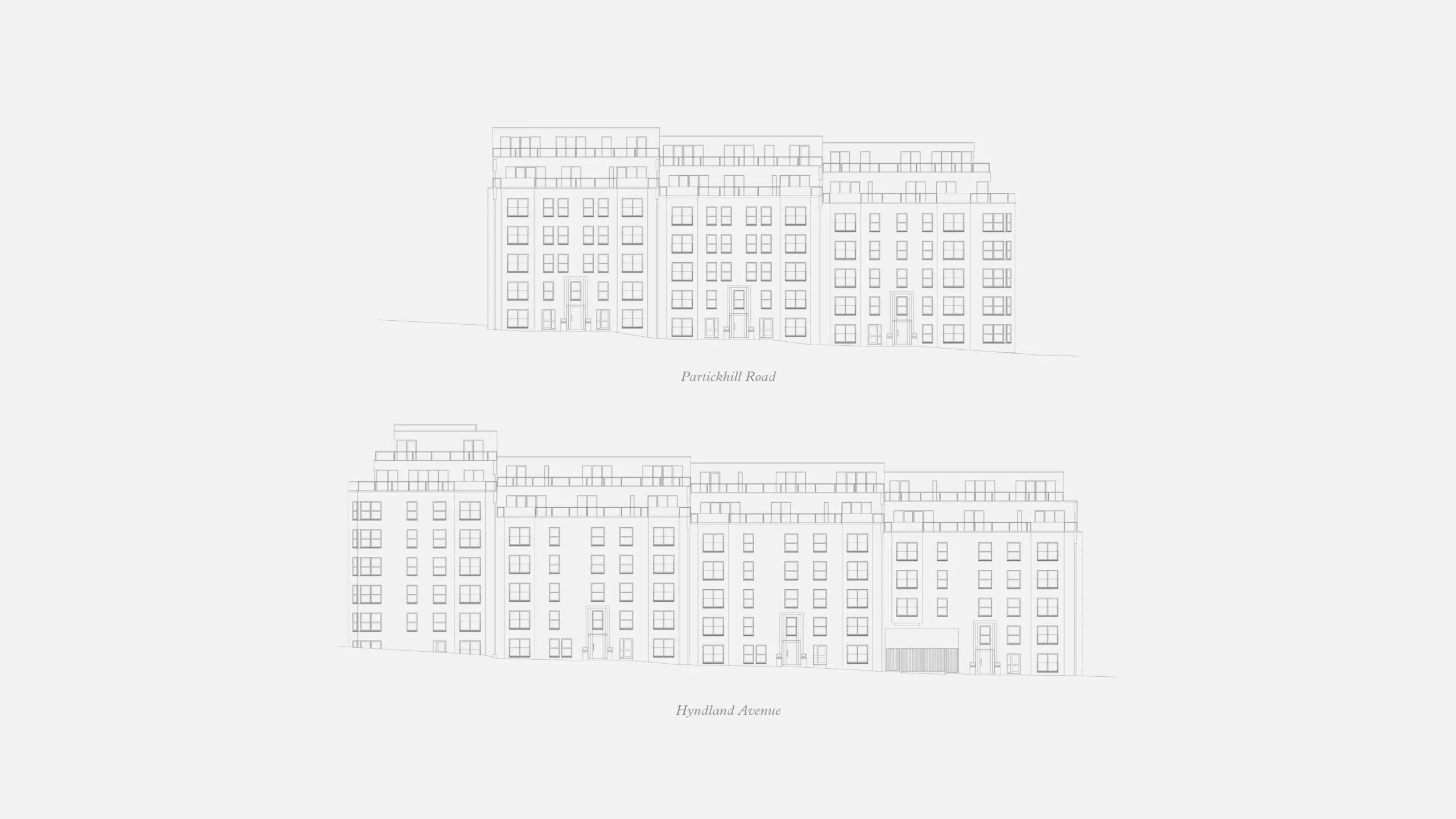
The brand identity was inspired by the building and its location within the Hyndland area. The building itself combines Edwardian prestige with a contemporary design bringing past and present together.
It was important that the brand reflected the quality of the architecture and connectivity of the area whilst retaining the appearance of a luxury development within Glasgow’s elusive West End.
Brand in hand
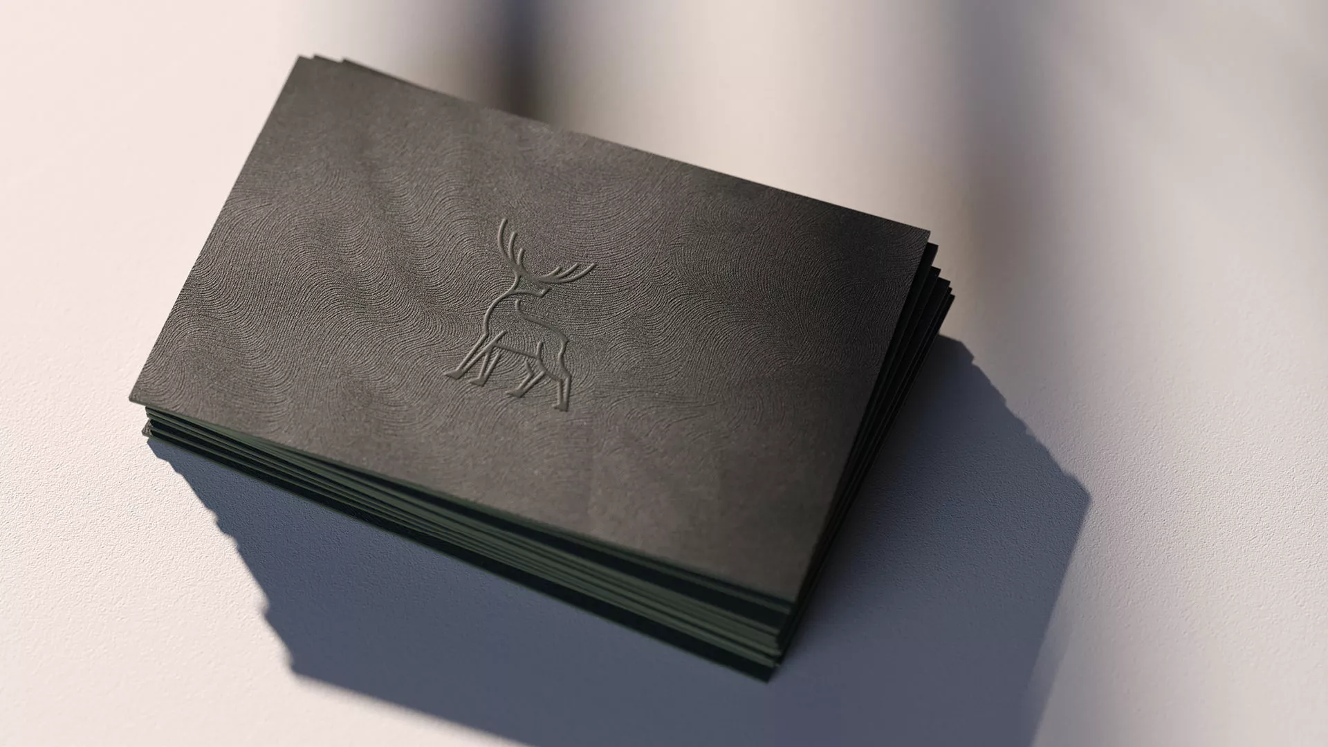
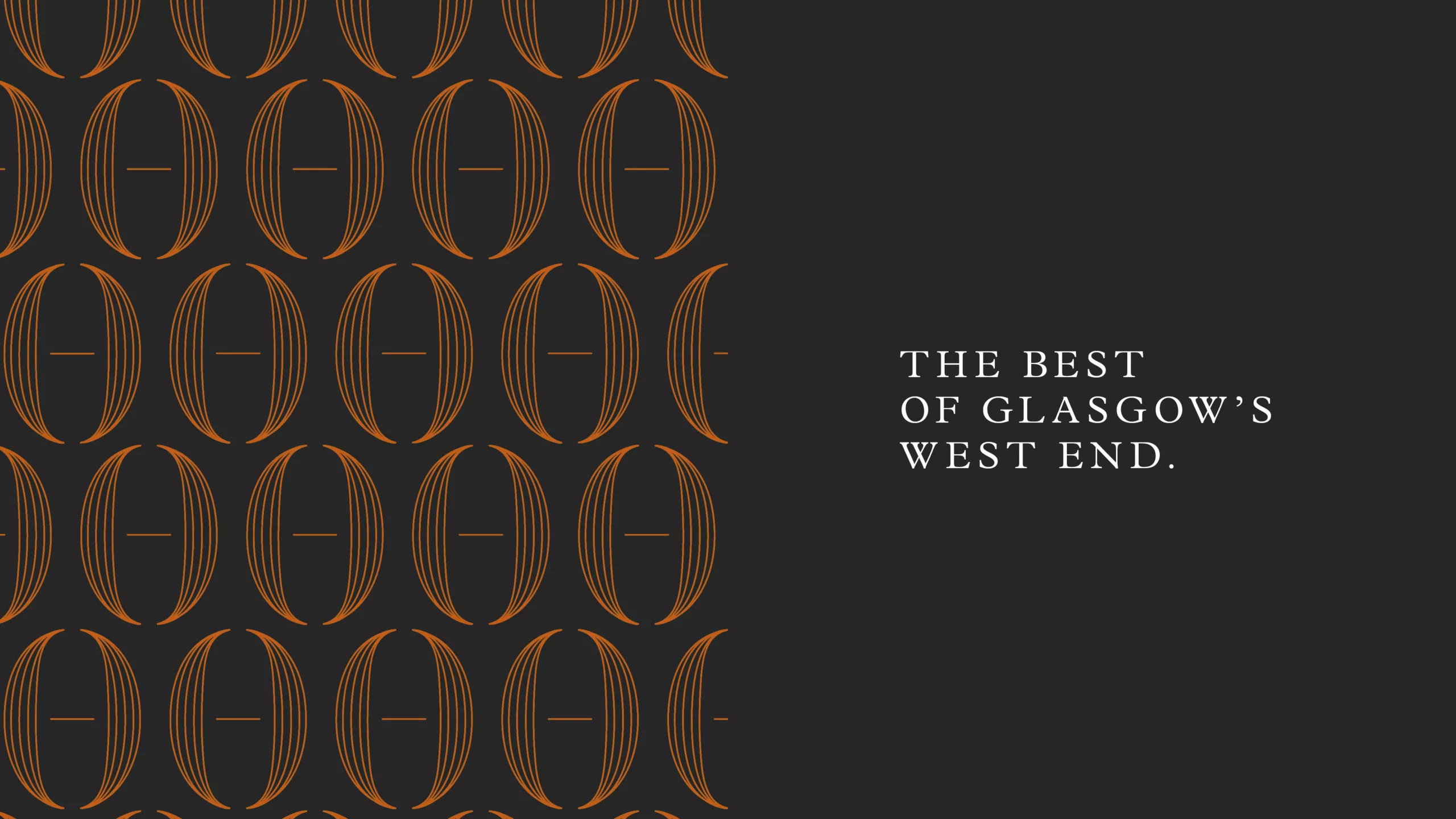
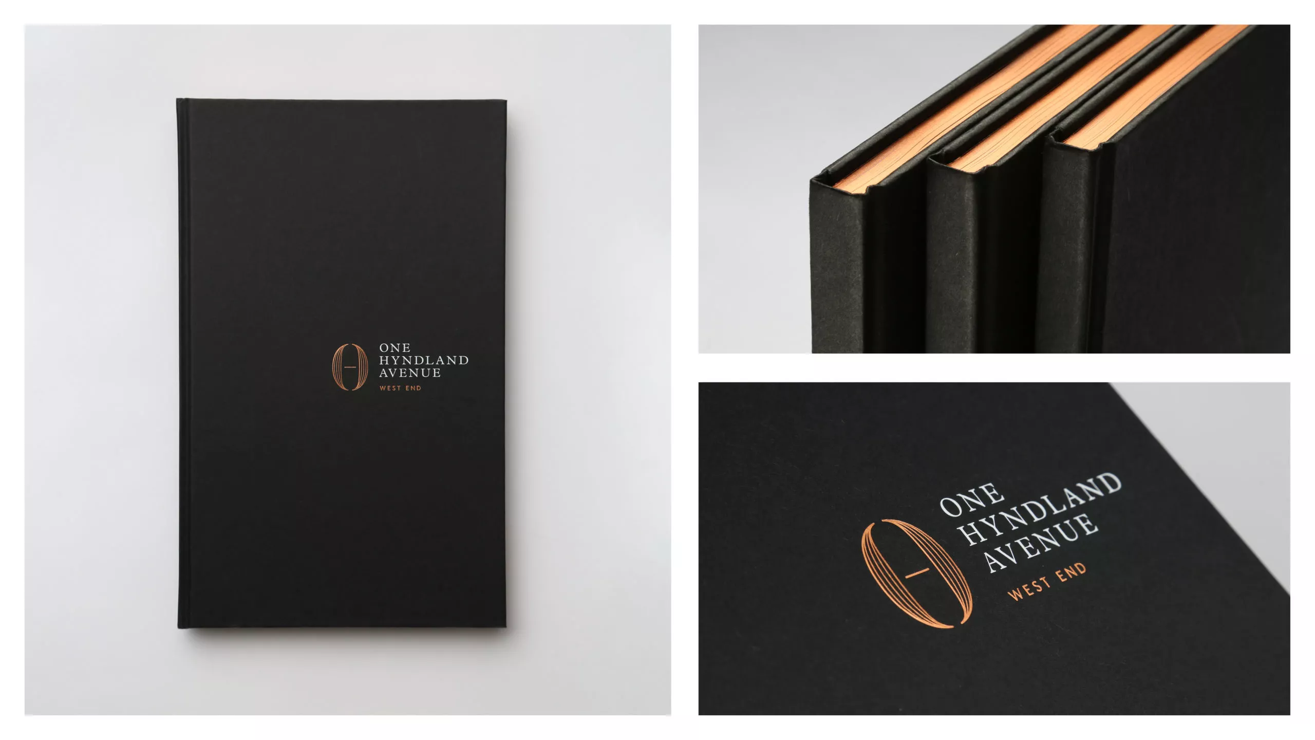
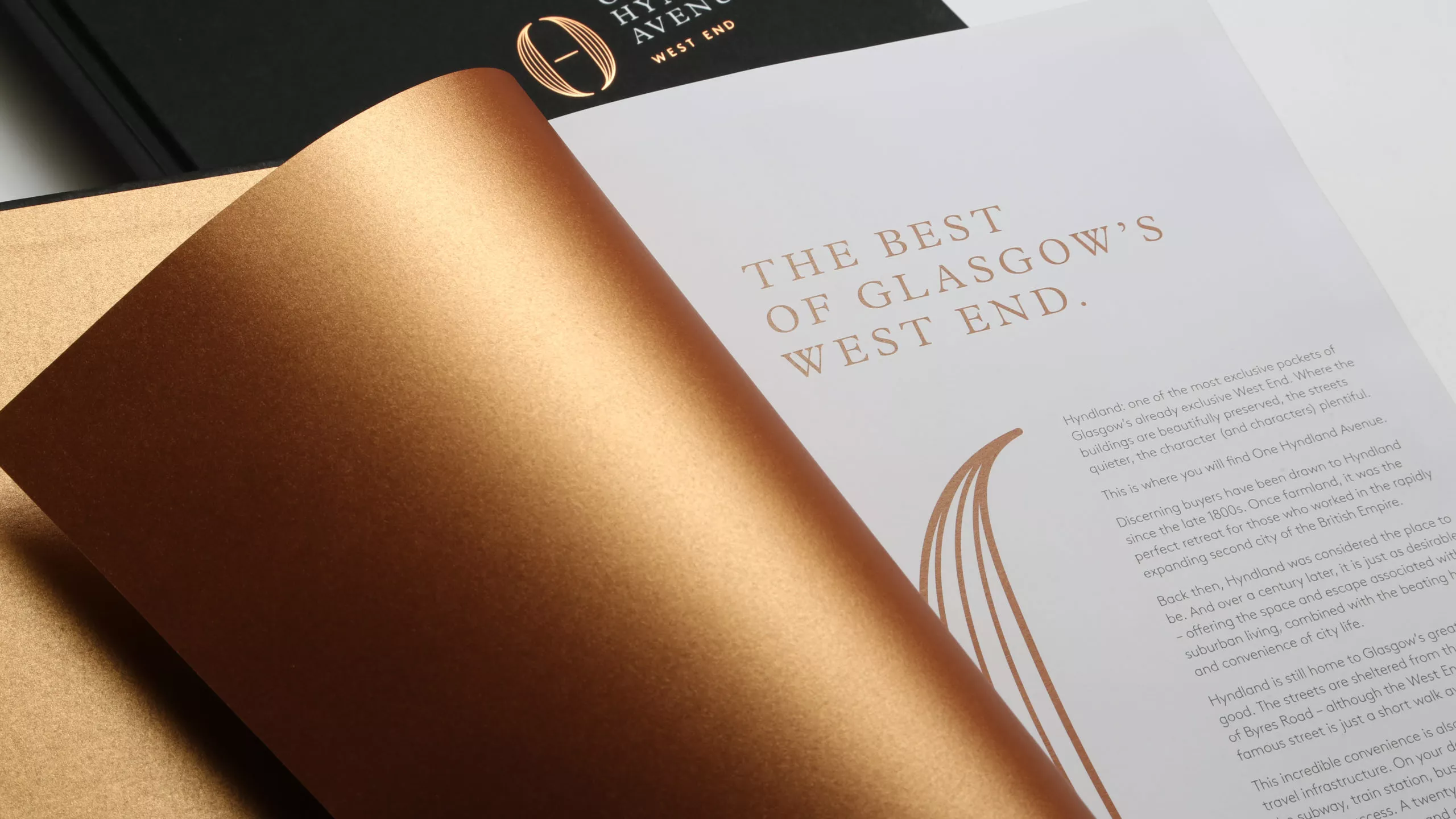
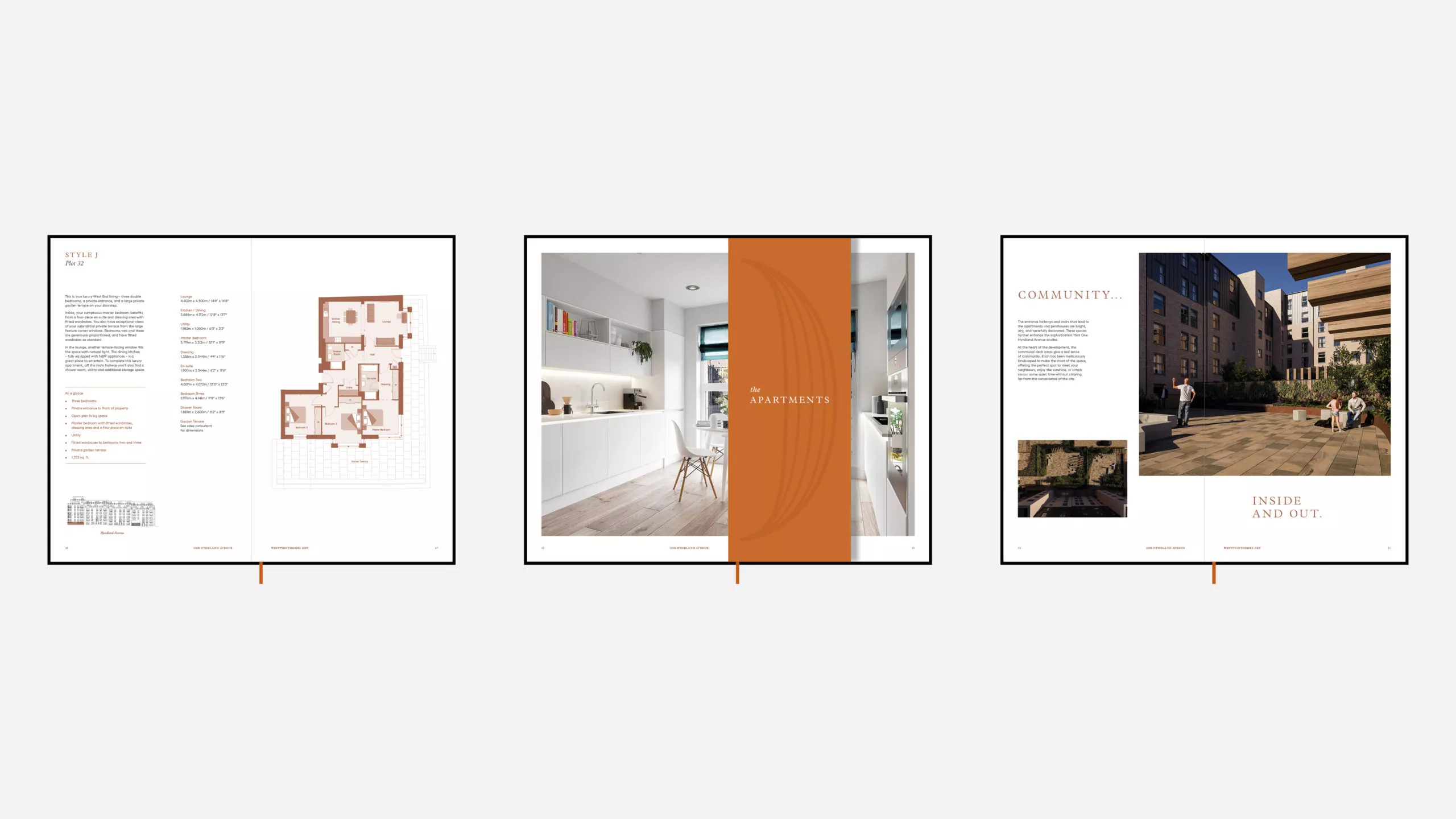
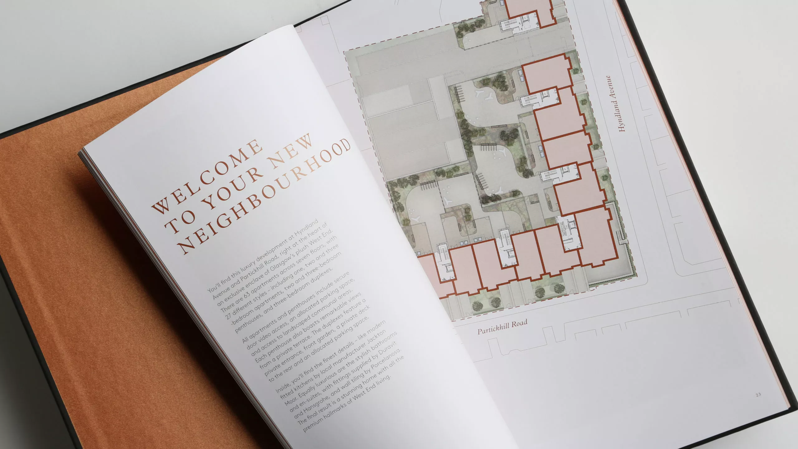
A rich mixture of copper foiling and tactile black paper lend themselves to this timeless classic. Hard case bound, this brochure feels fitting of it’s West End prime location. This is brought into the inside with metallic inks, full spread images and large scale floorplans.
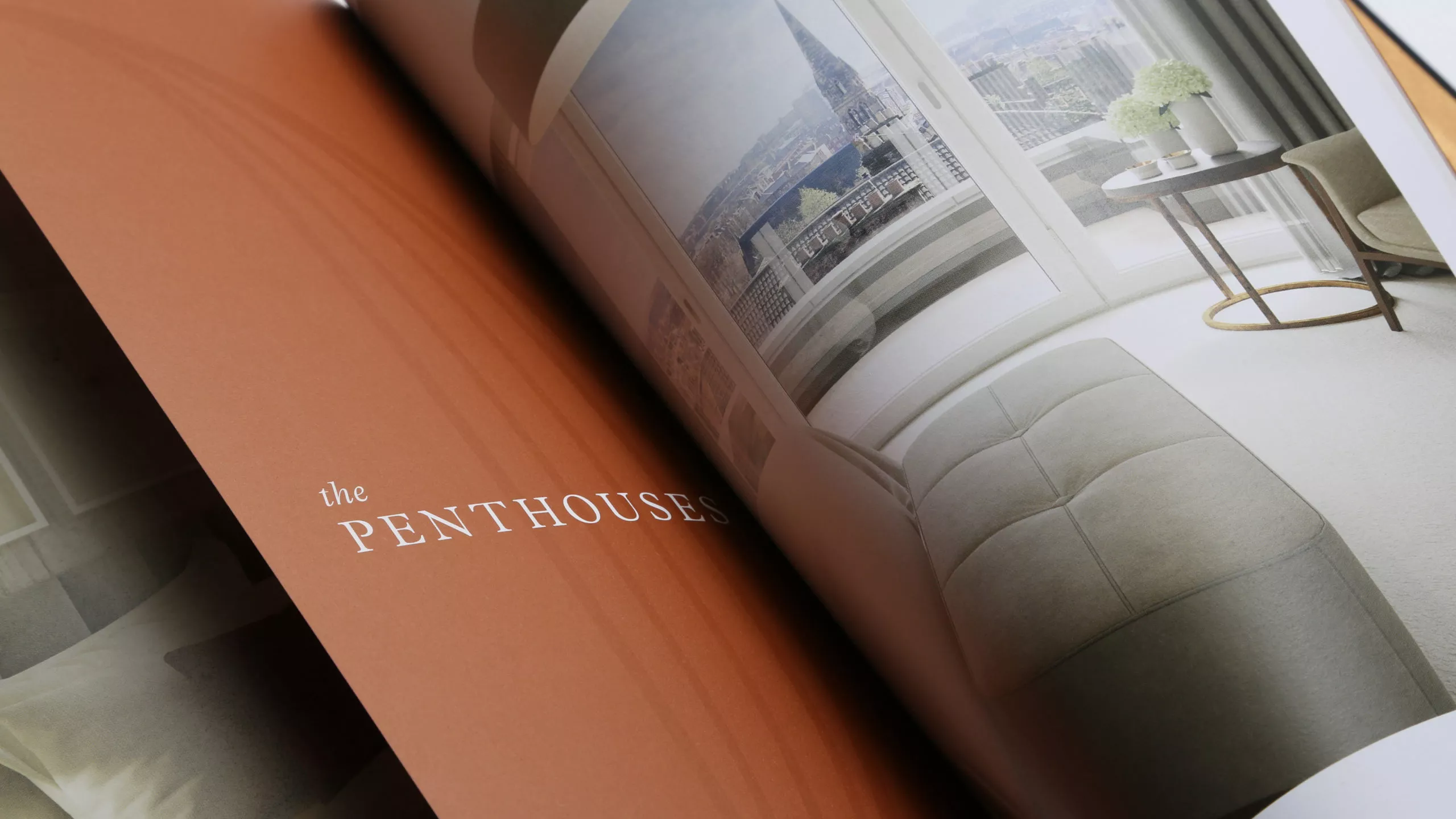
We worked with industry experts to bring the property to life with CGI interior and exterior renders. Often a challenge when selling off plan this allows prospective buyers a glimpse into the lifestyle that awaits behind the copper clad doors.
More than a sales tool
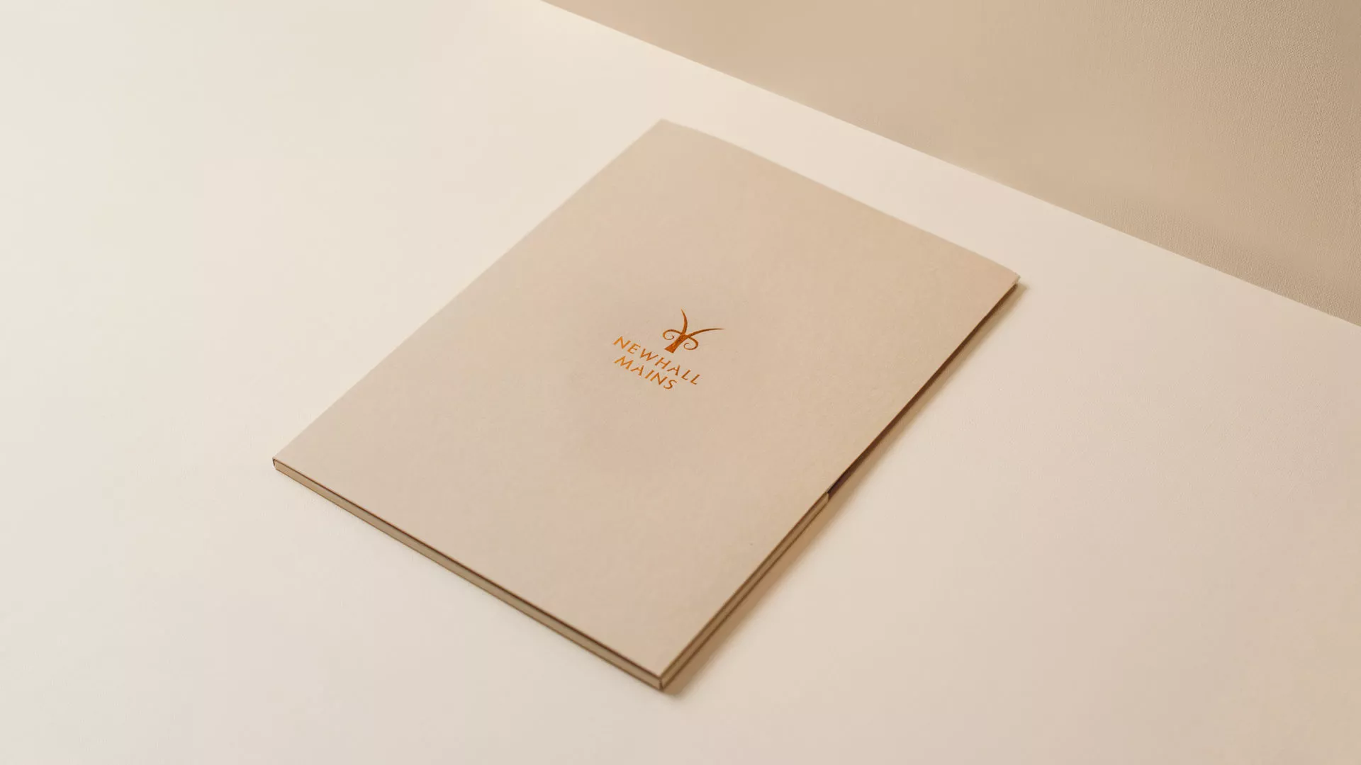
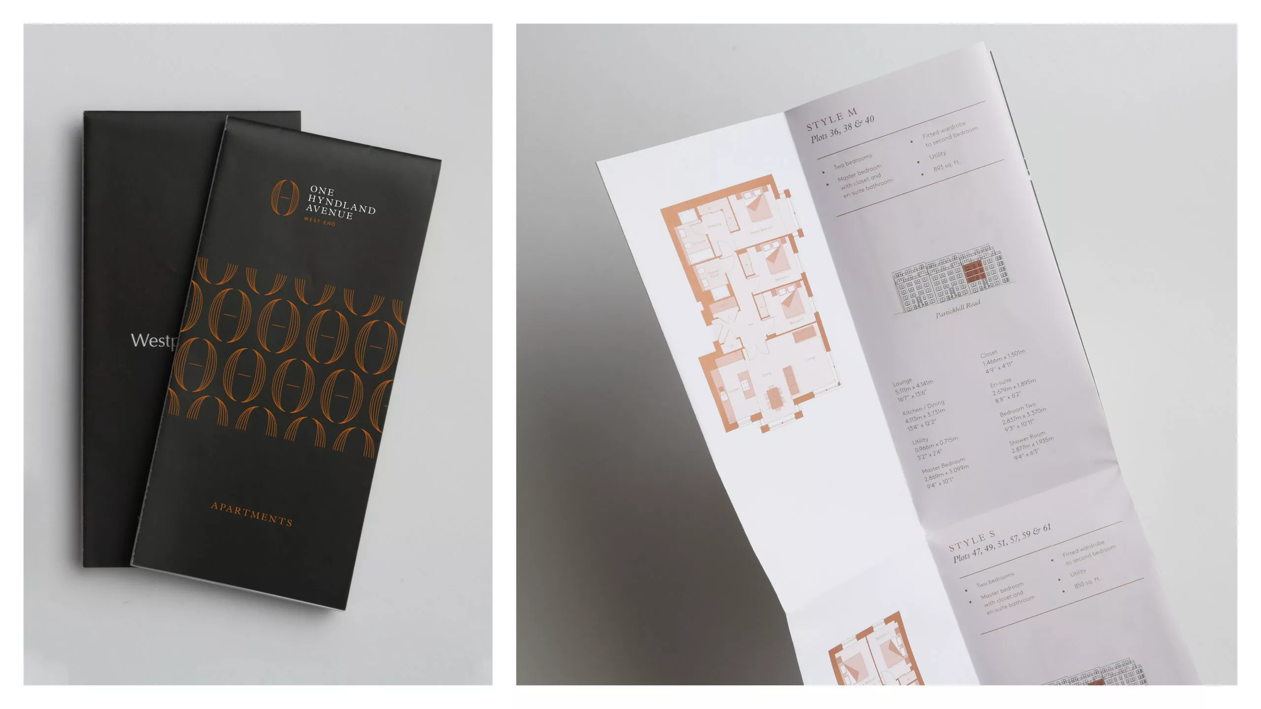
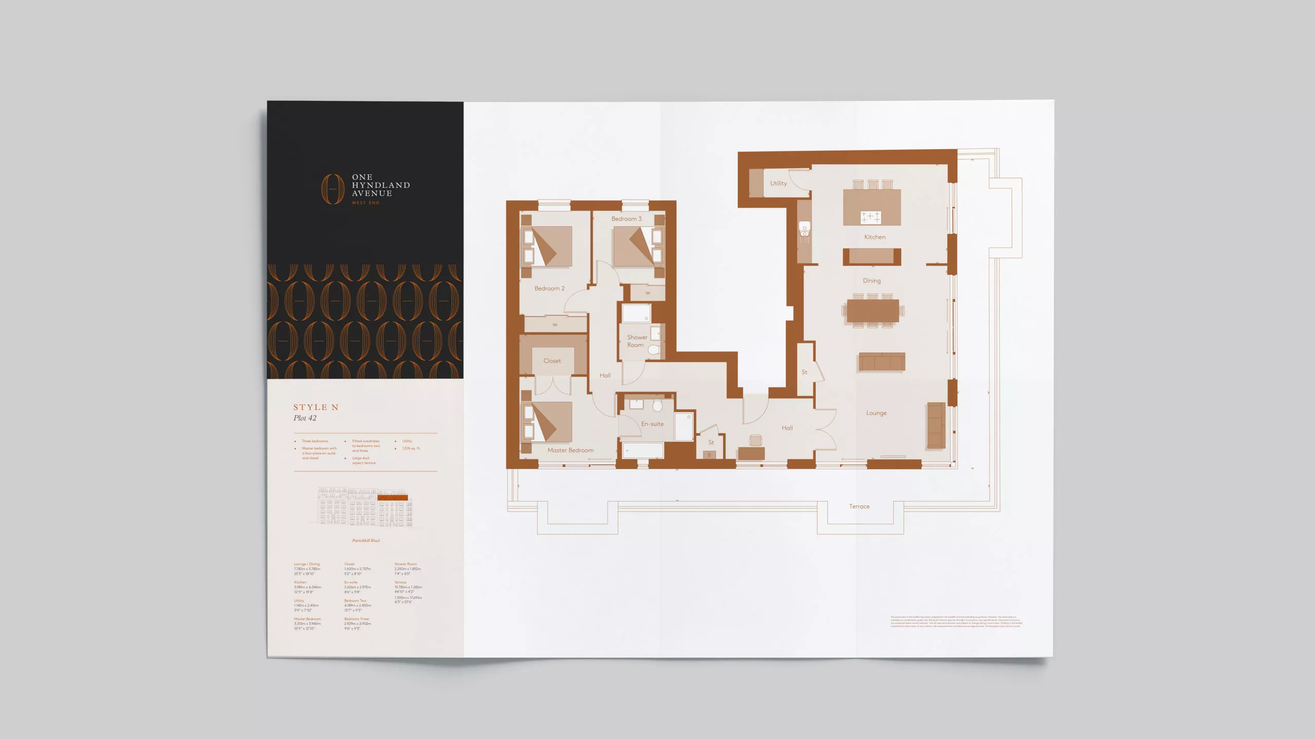
With a high footfall expected to the newly appointed sales office we wanted to develop a version of the brochure to allow all viewers to take away some information on the property. We developed a fold out sales sheet version for each apartment type, allowing the sales team to tailor the information for each client. From one and two bed apartments, to duplexes and penthouses this development has something for everyone.
What We Do
We strip back the unnecessary and untangle the complex. Behind every creative project, there is a collaborative process and solid creative strategy built to deliver meaningful impact.
