Little’s Funeral Service
Brand refresh, positioning and new website for established family run funeral service.

The Challenge
Since 1985, Little’s has provided a personal and caring family funeral service in Glasgow and the surrounding areas.
Over the years, the brand had become inconsistent and challenging to apply, with multiple logo variations and issues with legibility and tone of voice that required alignment.
With the new digital presence in mind, it was time to re-evaluate how Little’s presented itself and communicated with clients.

Approach
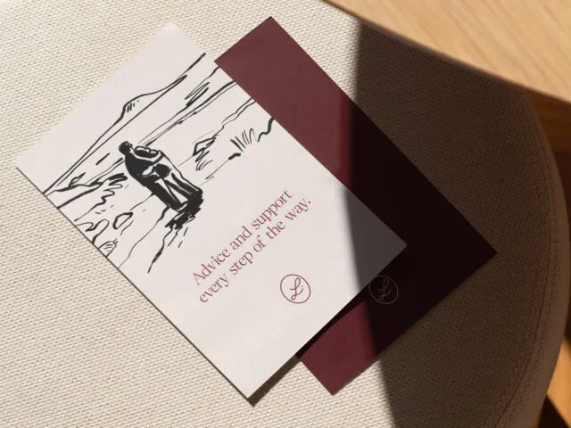
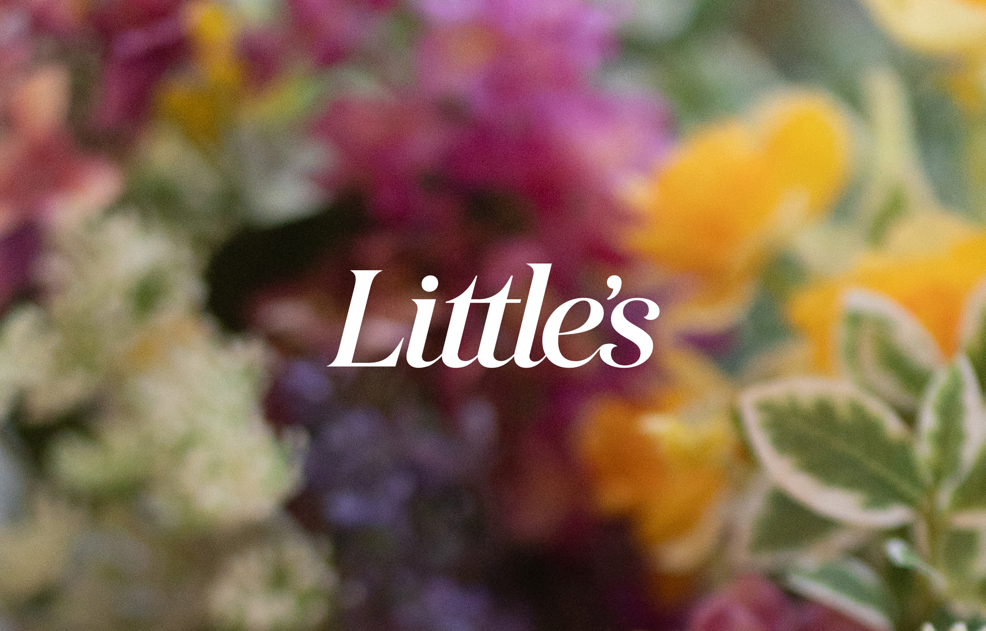
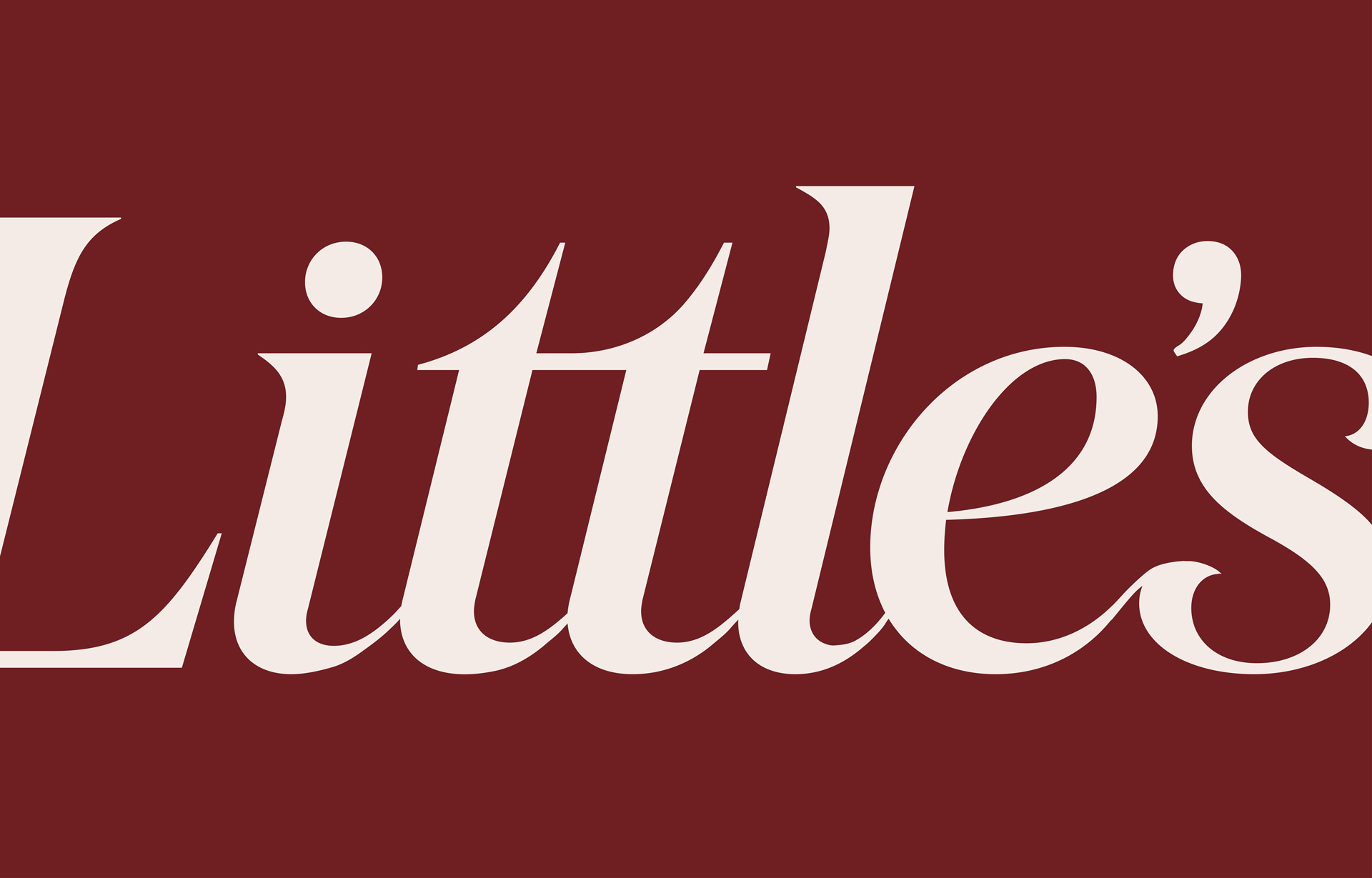
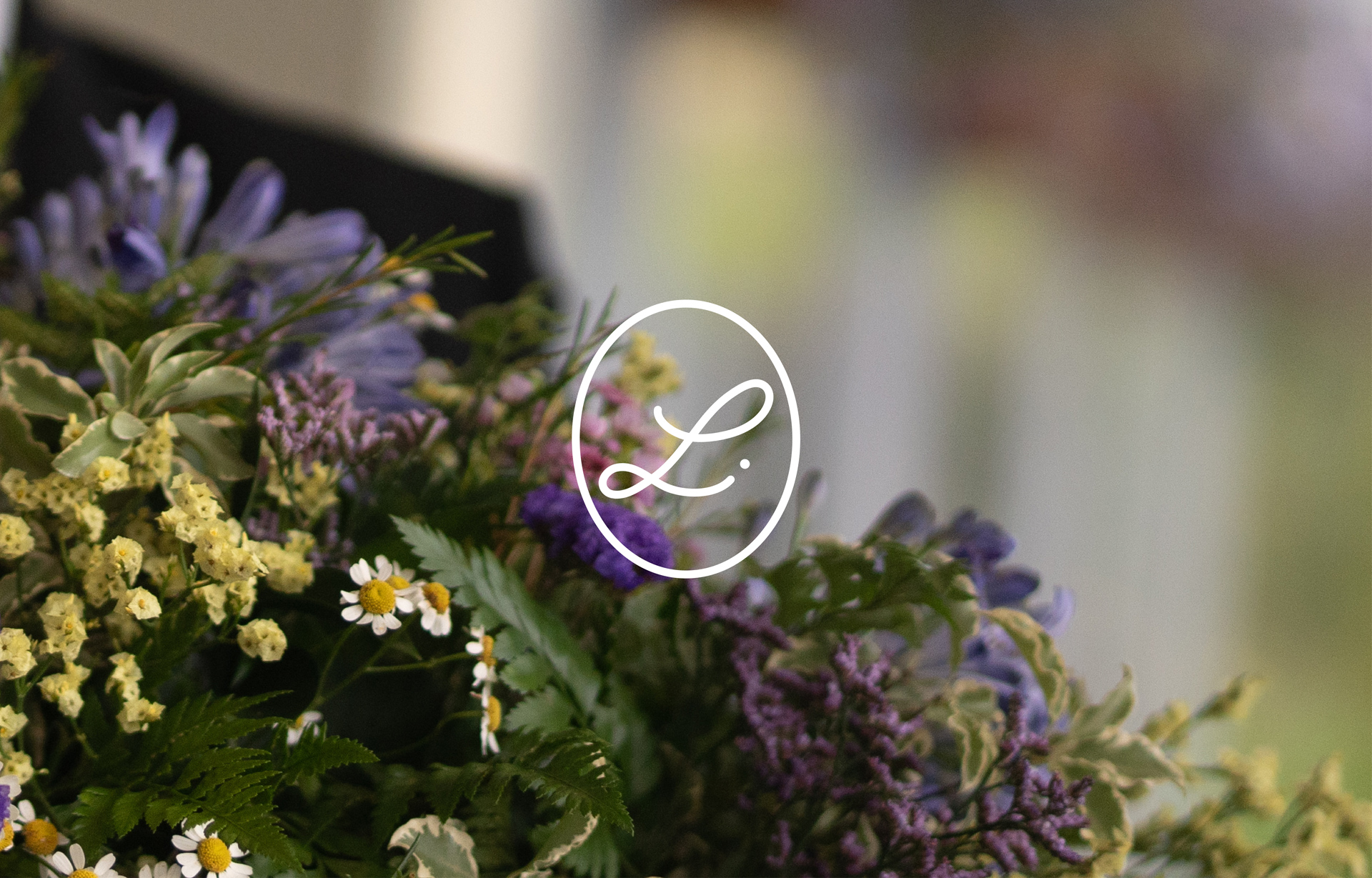
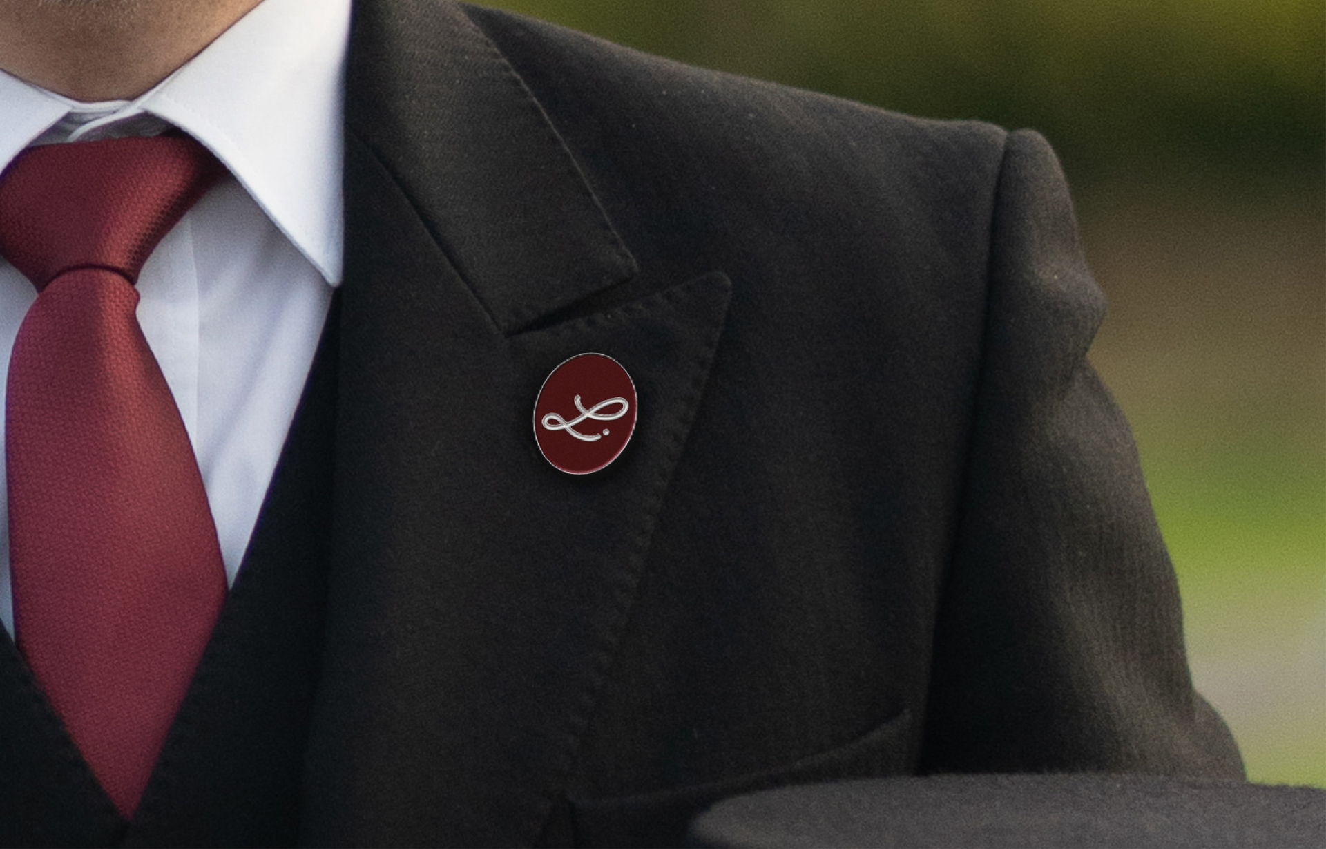
A new logotype was created, inspired by the heritage typography of the brands first logo. This update addressed legibility issues and introduced a modern aesthetic, while retaining a sense of familiarity with the original brand. A supporting monogram was created based on hand writing from the original founders. This personal touch reflects the highly personal and compassionate service provided by their funeral directors.
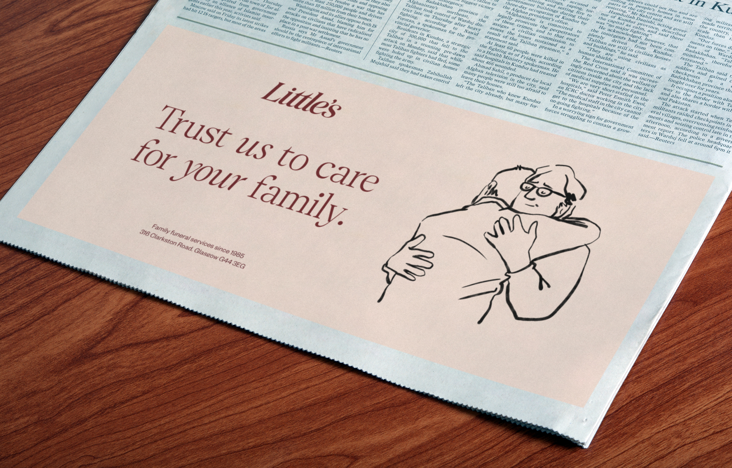
‘Trust us to take care of your family’ became the foundation of the new brand positioning. This language was developed around the core values of family and trust, with particular care taken to highlight that family members are taken ‘into care’ and will reassuringly be looked after.
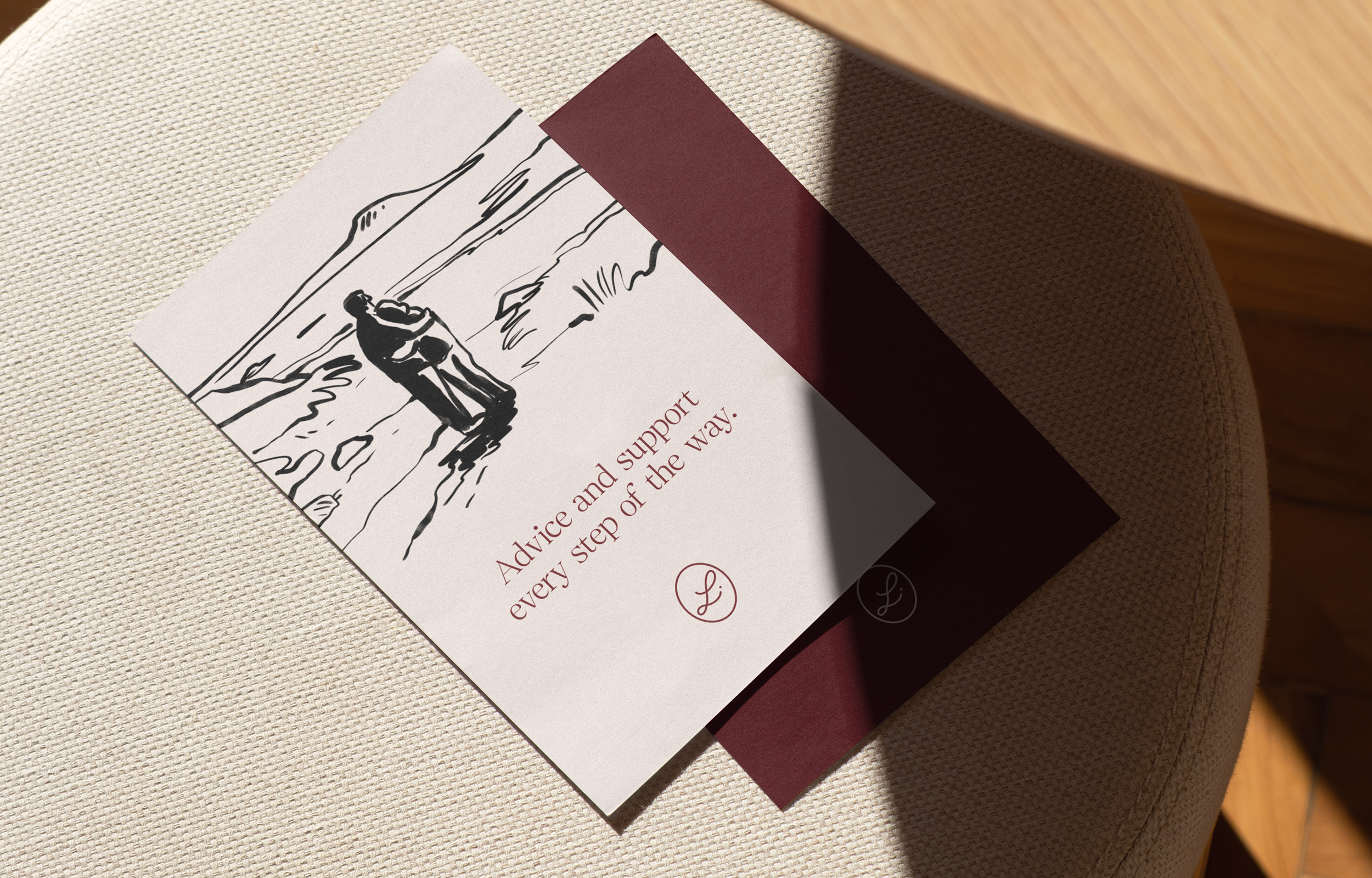
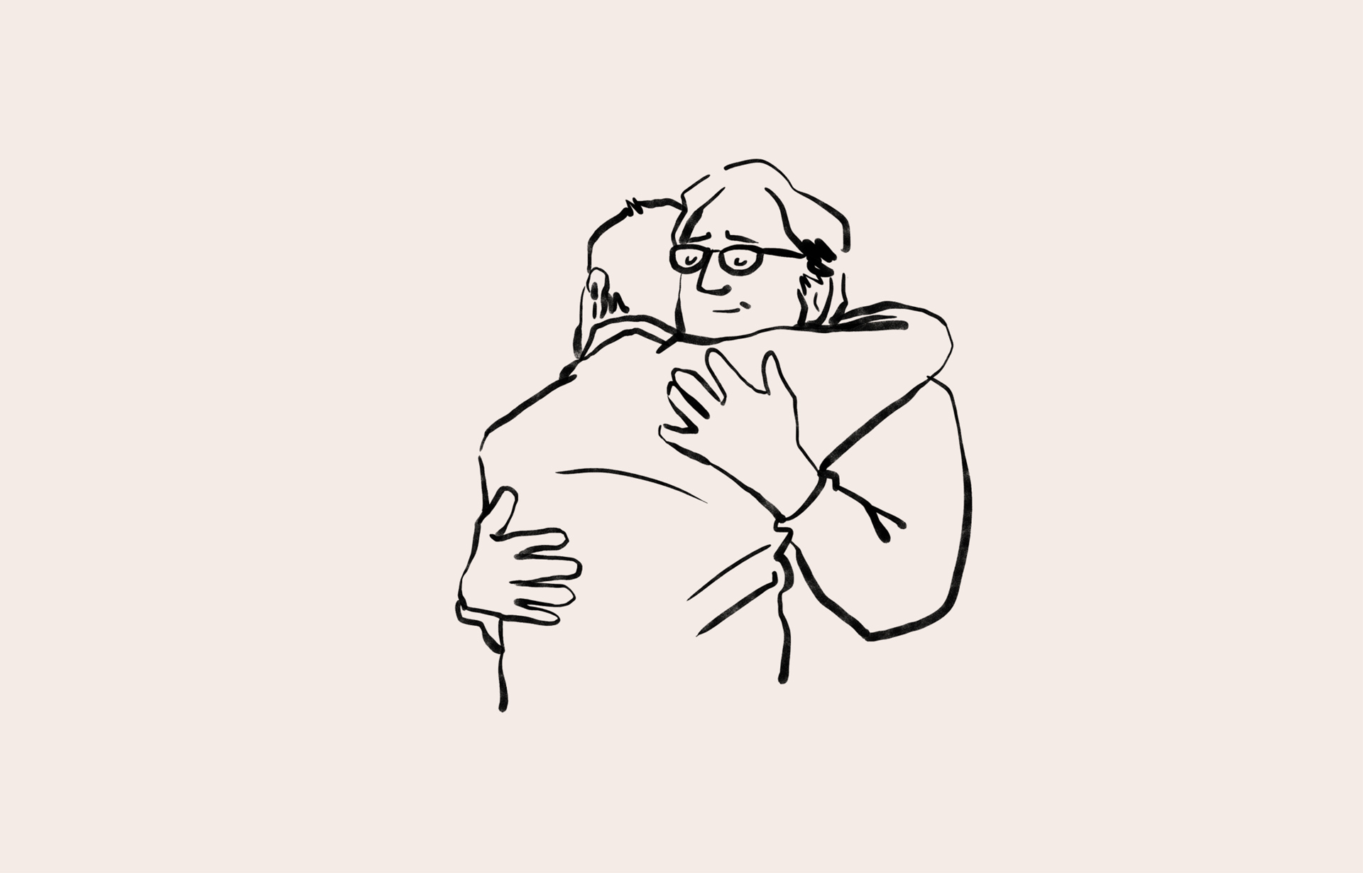
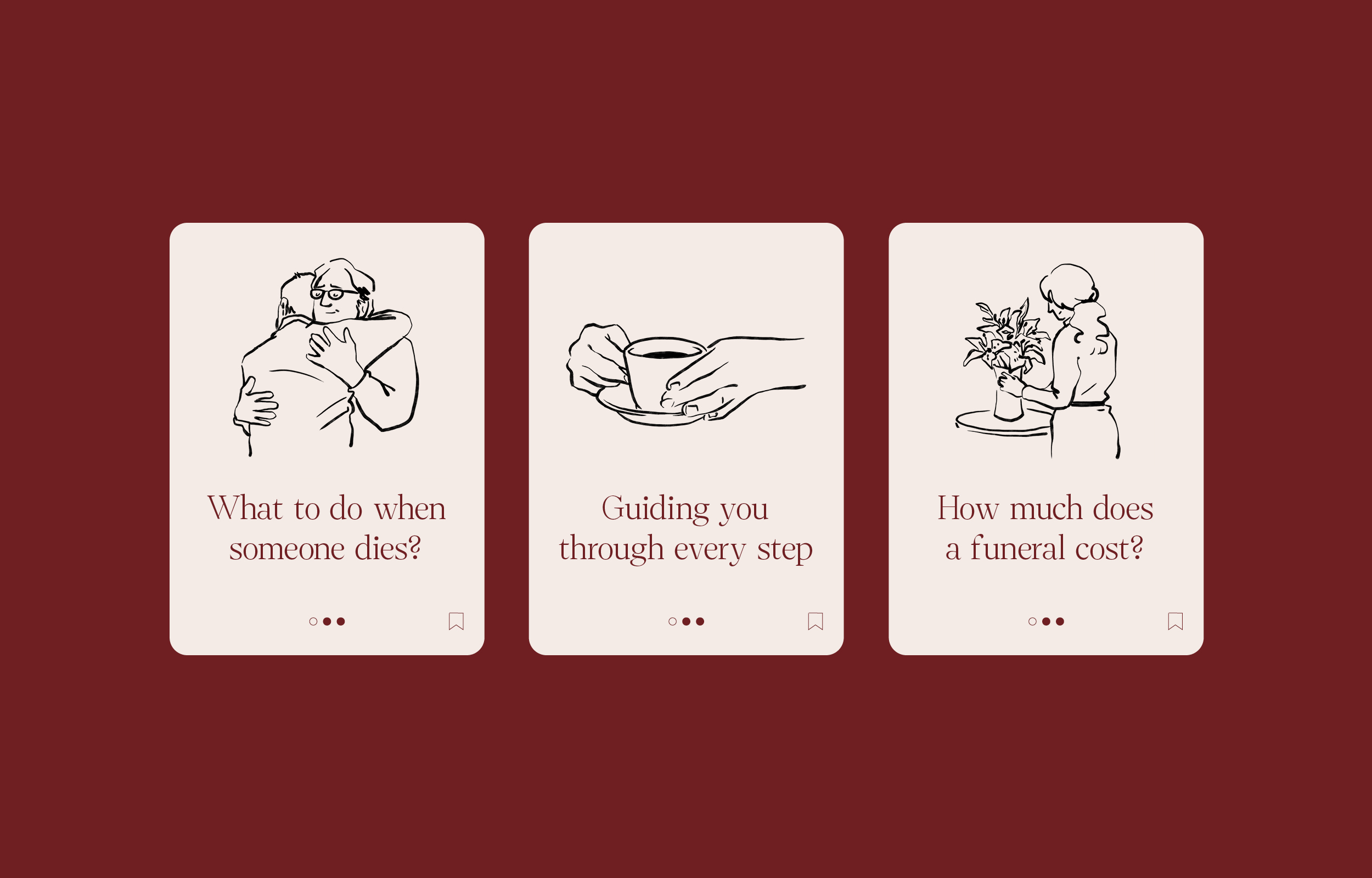
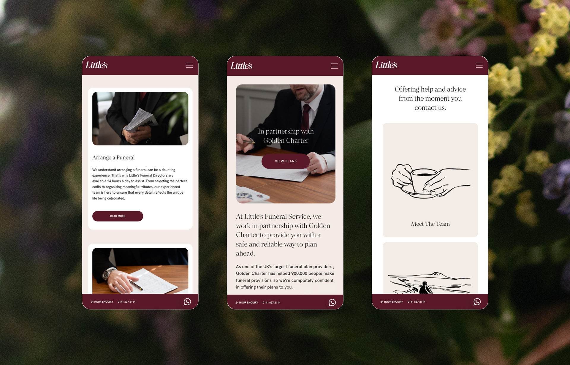
Soft, hand-drawn illustrations and a new photography suite were introduced to complement the messaging, helping to communicate in a compassionate and respectful way.

New Digital Presence
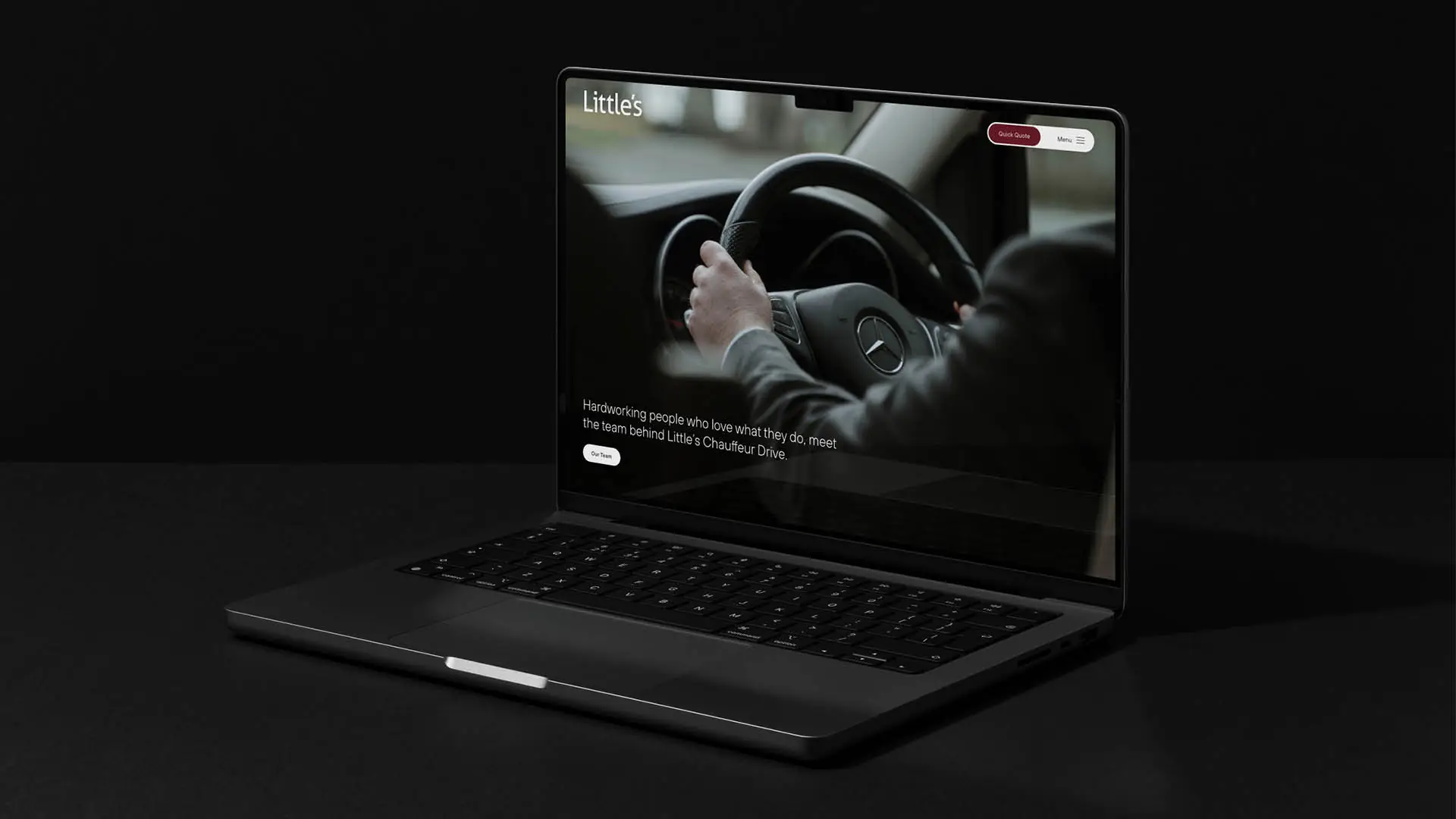
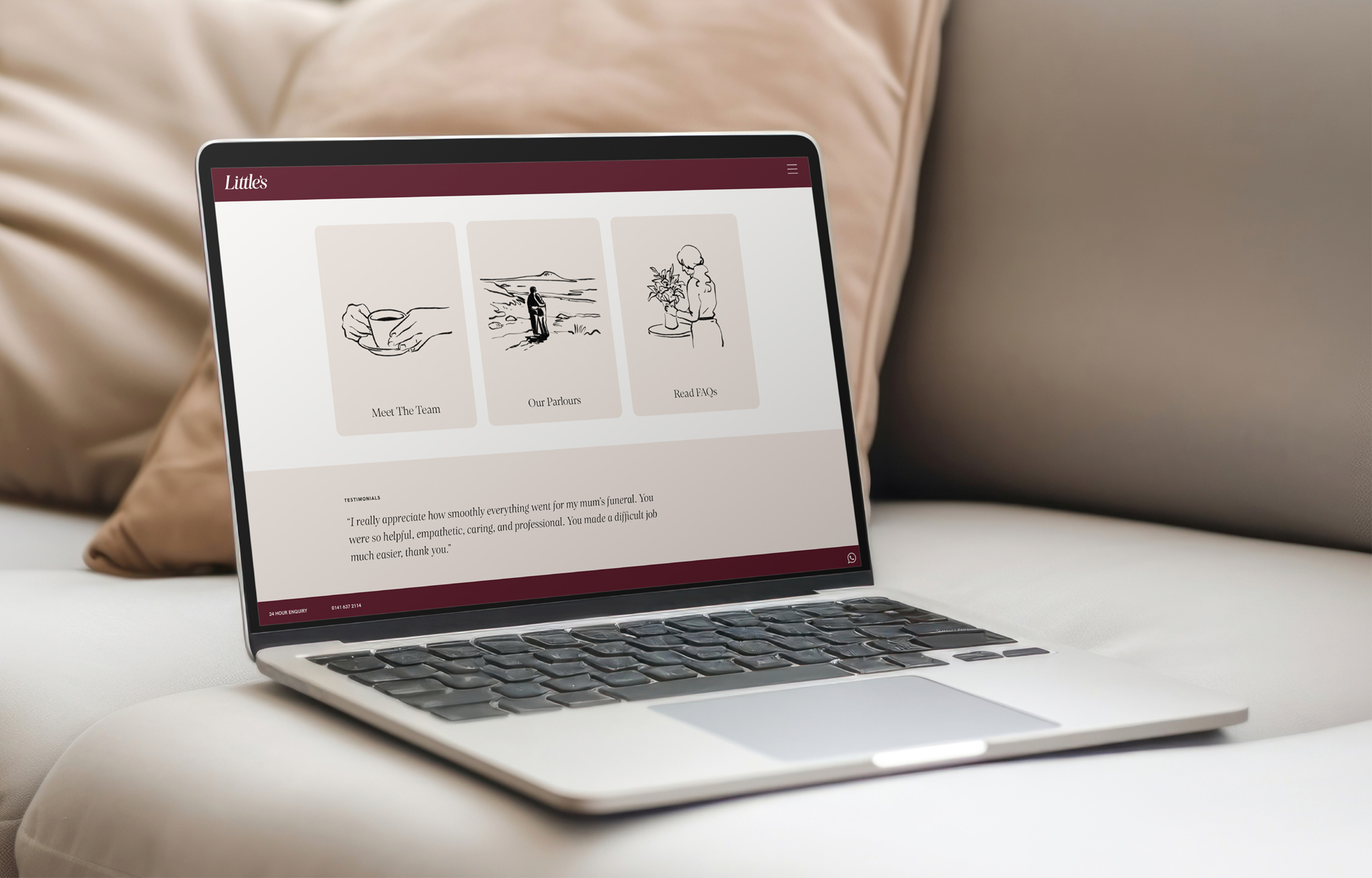
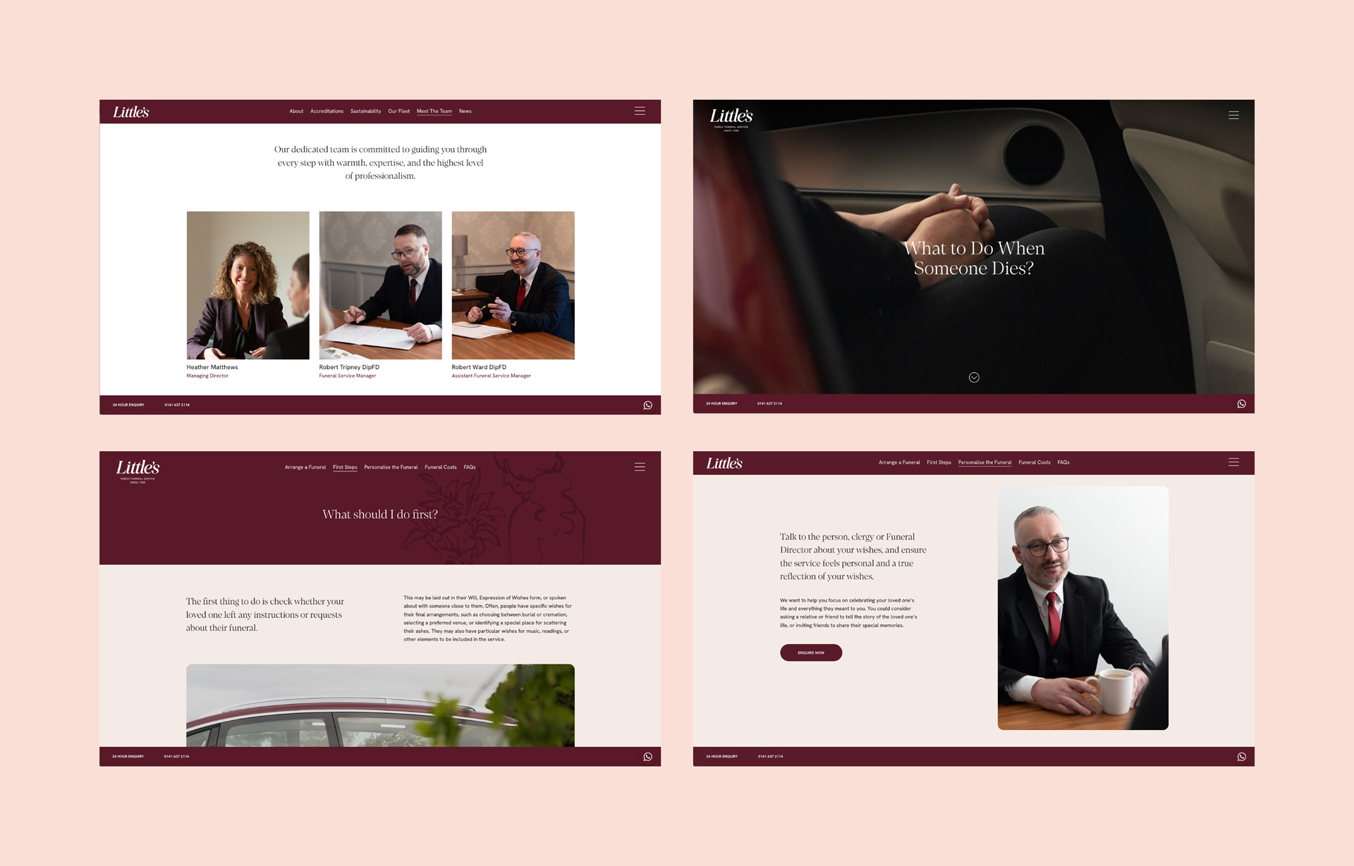
Little’s new website focuses on simple messaging and ease of navigation for visitors. With subtle yet clear calls-to-action, it was important to inform users that Little’s is available to discuss requirements 24 hours a day, 7 days a week.
The website also serves as a platform to convey that Little’s is a family business with years of experience, introducing the team in a warm and approachable way.
Illustrations by Mireille St-Pierre
Photography by Otago.

What We Do
We strip back the unnecessary and untangle the complex. Behind every creative project, there is a collaborative process and solid creative strategy built to deliver meaningful impact.

